Font Rendering Across Rich Platforms
Although I used to work for Microsoft on the WPF team, I’m not tied to the platform. WPF and its alternatives (Flash, HTML, Apollo, Silverlight) each have advantages and disadvantages and choosing between them depends on your requirements. Since I’m doing a lot of work around reading experiences, I thought it was a good time to go back and re-evaluate the existing choices.
In this post, we’ll look at how each platform renders fonts at 9, 10, 12, and 14 points – sizes commonly used for reading. I’ve used three fonts:
- Verdana: The old standby, installed on many systems.
- ITC Cheltenham: A serif frequently used in newspapers.
- Gotham Rounded: A sans-serif that I happen to like.
For no good reason, I’ve placed the results in alphabetical order. First up is Flash.
Flash
Up until a few years ago, Flash used to render fonts poorly at small sizes. Most authors worked around this limitation by changing the type of anti-aliasing used when displaying fonts. Flash provides two anti-aliasing options, one for readability and the other for animation. Additionally, Flash also allows the author to disable anti-aliasing altogether, and use aliased bitmap fonts. Flash 8 introduced a new rendering engine that vastly improved the quality of small-type text.
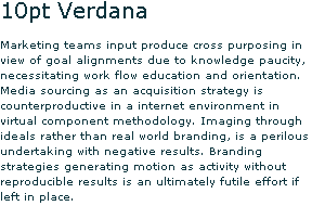
At small sizes, the readability setting is (unsurprisingly) far superior to the animation setting. Here’s a sample of the readability anti-aliasing for Verdana at 10 point:
For the same font and size, the animation setting is quite ugly:
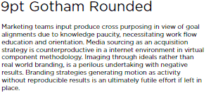
Although it creates clearly more readable results, the readability smoothing creates a strange coloring effect that can be pretty noticeable at small sizes. Here’s Gotham Rounded at 9pt:
On my monitor, the effect is subtle, but noticeable – I see a bit of color around the edges of the letters.
Flex / Apollo
Apollo (through Flex) has two different font rendering engines – one of which seems to be shared with Flash (the documentation is a little vague here, so feel free to correct me if I’m wrong). The other rendering engine has access to installed fonts, and is recommended for small type sizes – however the quality is quite bad. From my simple tests, it seems that the fonts are always aliased, producing the jaggy look seen below:
This aliased look is acceptable for some fonts, such as Verdana, that have reasonable bitmap representations at small sizes. However, for many fonts the result is unacceptable, such as this sample of Cheltenham at 10 point (from Flash set to bitmap, not Flex):

Except for extreme cases, it looks like it’s best to use the Flash font rendering system when writing an Apollo (or Flex) application. (Once again, I’m under-educated in the Apollo and Flex realms, feel free to drop some knowledge in the comments)
HTML
On my machine, the Firefox and Internet Explorer 6 both rendered extremely similar results. The Firefox rendering is shown below:

The lack of subpixel positioning destroys the serif font at small sizes. You can see the effect at larger sizes as well – here is Cheltenham at 14 point:

You can see the strange letter spacing in the first line – compare “Marketing” and “cross” to see the difference.
The sans-serif fonts fared better in the browser, with Verdana doing particularly well as it was specifically tuned for on-screen use.
Internet Explorer 7 uses ClearType for its font rendering, and should therefore produce results that are nearly identical to WPF.
Silverlight
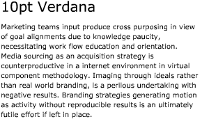
Silverlight is the least mature of the platforms (since Apollo leverages both Flex and Flash). The 1.1 Alpha version that I tested unfortunately does not support the Adobe CFF font format – meaning I was unable to test Cheltenham or Gotham Rounded. Silverlight doesn’t use the ClearType algorithm used by WPF, instead it uses gray scale anti-aliasing with gamma correction. The results are generally good, with the clear weakness being at small sizes. Here is Verdana at 9pt in Silverlight:
At this small size, Verdana looks a bit fuzzy. The effect is less noticeable at 10 point, but still there.
WPF
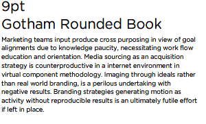
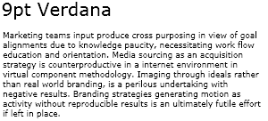
All text in WPF is rendered with ClearType – developers have no way of opting out of this (actually, there is a way, but it’s pretty awkward and not really well known). The quality of text at small sizes is impressive, here’s Gotham Rounded at 9pt in WPF:
It’s slightly fuzzy and a bit gray, but overall a bit better than the flash version.
Verdict
Overall, the results are pretty good. The only engine with poor results is the native Flex engine, but with support for Flash, there’s a clear, easy to use alternative at your disposal.
Although the browsers work quite well with standard web fonts (and any other specifically tuned for small sizes), they are not an acceptable choice for traditional print fonts – especially Serif faces (Internet Explorer 7 being the exception). Considering the lack of cross-browser font-embedding, this probably isn’t a problem for most.
Silverlight is still a baby in this space, and it shows (there’s currently no way to set line height, for example). The anti-aliasing looks pretty good at larger sizes, but is noticeably fuzzy at smaller sizes. Although it’s better than what most browsers provide, it still has a way to go before catching up to Flash and WPF.
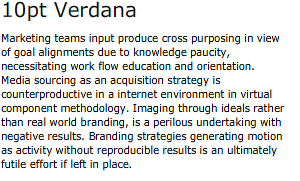
The final two contenders are Flash and WPF – and it’s a close call when it comes to rendering. Here are three side-by-side samples for WPF and Flash. The first is Verdana at 9 point (all samples show Flash with readability anti-aliasing):
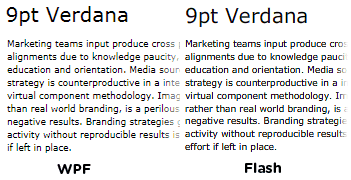
Although the Flash version has a nicer color, the WPF wins by a hair here, for being a bit smoother and less blurry (look at the “B” in “Branding” in the Flash version, third line from the bottom). Let’s move on to Gotham Rounded at 9pt:
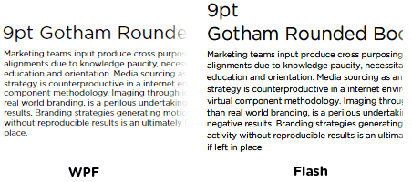
Once again, Flash has stronger lines than WPF, but it’s uneven and has a bit of color fringing. Finally, let’s look at Cheltenham at 12 point:

This time, WPF is a bit darker than Flash. This one is really a toss-up and depends on personal preference. Flash is a bit sharper, but the WPF version is smoother and more consistent.
Overall, I think WPF has the edge when it comes to font rendering, although it’s quite close and could easily come down to user preference.
Next Steps
This analysis is a bit rough, there’s a bunch on my to-do list here, including:
- Testing FlashType in Flex and Apollo
- Testing non-CFF fonts in Silverlight
- IE 7, Mac OS, and Ubuntu screenshots
- More fonts
Also, the font rendering is just one aspect of a user’s reading experience. Obviously layout, performance, installation, and many other factors come in to play here.